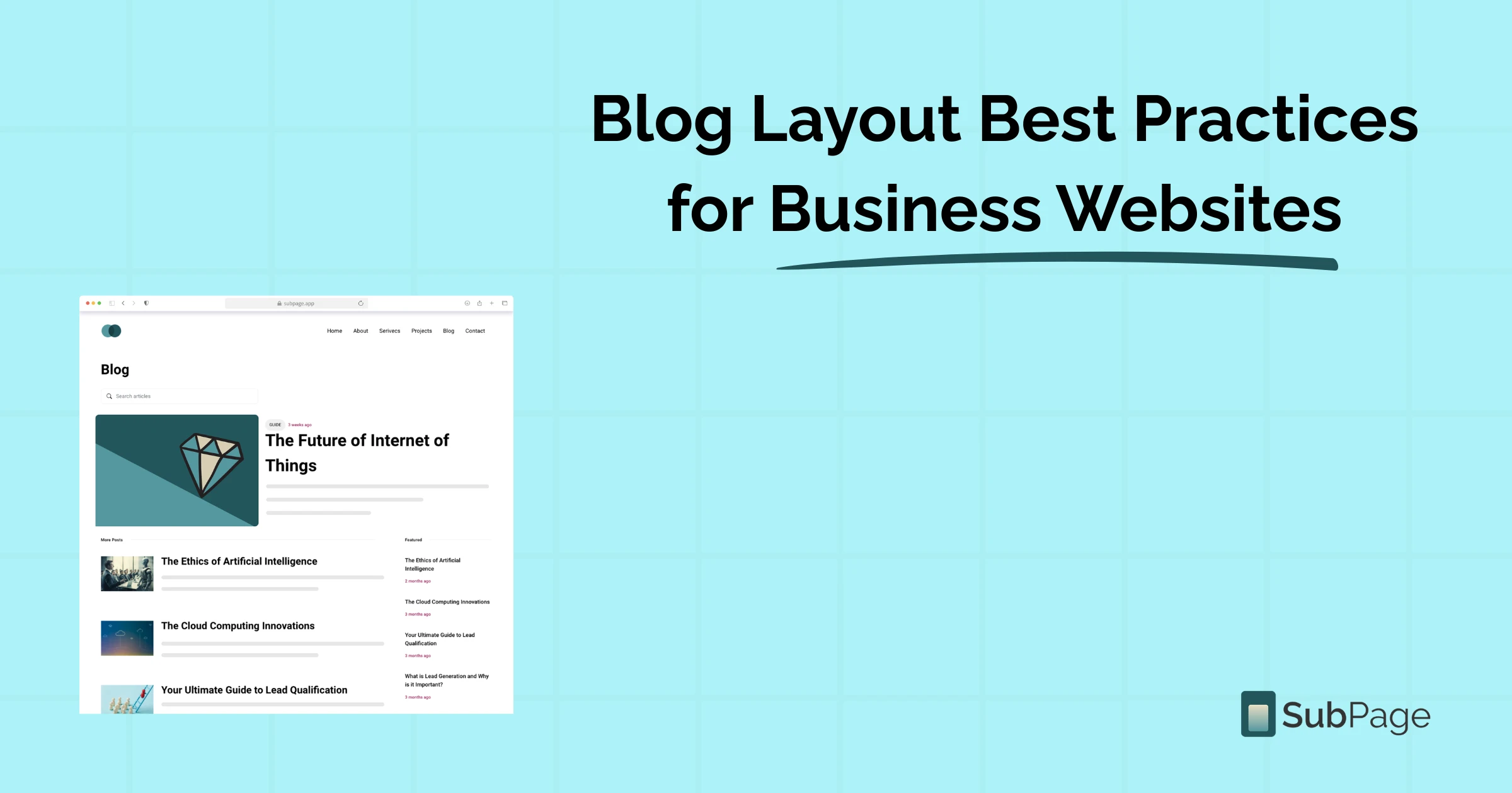
Blog Layout Best Practices for Business Websites
Did you know that businesses that blog consistently generate 67% more monthly leads than those that don't? Yet many business blogs struggle to convert readers — not because the content is poor, but because the blog layout is letting it down.
The way a blog page is structured directly affects how long visitors stay, how much they trust your brand, and whether they take action. A thoughtful layout guides readers from headline to CTA without friction. In this guide, we'll walk through what makes a high-performing blog layout, share proven blog layout examples, and show you how SubPage makes it simple to build blog pages that both rank and convert — no developer required.
Why blog layout matters more than you think
When a reader lands on your blog, they decide within seconds whether to stay or bounce. Research from the Nielsen Norman Group shows that users read only about 20% of the words on a page — they scan. This means your layout has to do most of the heavy lifting before your words even get a chance.
A strong blog layout achieves three things simultaneously: it signals credibility, aids readability, and nudges the reader toward the next action — whether that's subscribing to a newsletter, exploring related content, or signing up for your product.
For business websites in particular, a poor layout can actively damage your brand. Inconsistent fonts, walls of unbroken text, buried CTAs, and confusing navigation leave readers lost — and lost readers don't convert.
The anatomy of a high-performing blog layout
Let's break down the core components that every effective business blog page should include. Think of these as the non-negotiables.
1. A compelling header and hero section
The header is the first thing your reader sees. It should include your blog post title in H1 format for SEO, a featured image or banner, the author name, publication date, and estimated read time. These elements immediately establish context and build trust with both readers and search engines.
Many businesses also add a category tag or topic label in the header — this helps readers instantly know they're in the right place before they've read a single line of body copy.
2. A scannable content structure
Great content structure mirrors how readers actually consume information online — by scanning. Your body content should follow a clear visual hierarchy:
- H2 subheadings to separate major sections of the post
- H3 headings for supporting points within each section
- Short paragraphs of 2–4 sentences to avoid walls of text
- Numbered lists and bullet points to break down complex ideas quickly
- Bold text to highlight the most important phrases and stats
- Block quotes to emphasise statistics or expert opinions visually
This hierarchy isn't just good for readers — it's essential for SEO. Search engines use heading tags to understand the structure and relevance of your content. Weaving target keywords such as blog layout, blog layout examples, and blog layout into your headings and opening paragraphs naturally signals strong topical relevance to Google.
3. A sticky or fixed sidebar (for desktop)
A sidebar is one of the most underused assets in business blog layouts. When done well, it acts as a persistent navigation tool that keeps readers engaged without interrupting the reading experience. Effective sidebar elements include: a table of contents with anchor links, related blog posts, a newsletter signup form, a product or service promotion block, and social sharing buttons. The key is to keep it clean — too many sidebar elements reduce conversion on every single one.
4. Strategic internal linking
Internal linking keeps readers on your site longer, reduces bounce rate, and distributes page authority across your domain. If you're building a content strategy from scratch, SubPage's guides on SaaS content marketing tactics and crafting compelling CTAs for your blog are worth bookmarking — they go deeper on the conversion side of content.
5. Author bio and trust signals
In an era where Google's E-E-A-T framework (Experience, Expertise, Authoritativeness, and Trustworthiness) heavily influences rankings, the author bio is no longer optional — it's strategic. A short bio with a photo, credentials, and links to the author's social profiles adds credibility that both readers and search algorithms reward.
Complement this with social share counts, comment sections, or verified review badges to reinforce the quality of your content and encourage further engagement.
Blog layout examples that convert
The best way to understand what a great layout looks like is to study it in practice. Here are three proven blog layout examples that business websites use to drive traffic and conversions.
The long-form authority layout
Built for depth and SEO dominance, this layout features a large hero image, a prominent H1 title, a sticky table of contents near the top, and long-form content broken into clearly labelled sections. The sidebar contains a fixed CTA, related posts, and a lead magnet download. This layout is ideal for pillar content, definitive guides, and research-backed articles.
The listicle layout
One of the most widely shared content formats online, the listicle layout uses numbered H2 or H3 headings, short explanatory paragraphs, and visual breaks between items. It scans fast, performs well on mobile, and is easy to share on social media. The challenge is consistency — each numbered section should follow the same visual rhythm.
The conversational blog layout
Popular with SaaS companies, coaches, and personal brands, this layout prioritises voice and personality. It uses wider text columns, fewer images, and a minimalist design that keeps all focus on the writing. CTAs are typically embedded mid-post, after sufficient value has been built, and repeated clearly at the end.
Whichever format you choose, consistency is the key. SubPage lets you create reusable blog templates so every post you publish automatically inherits your chosen layout — fonts, spacing, sidebar placement, and CTA blocks all included. You can also read more on the dos and don'ts of SaaS blogging to make sure your content strategy matches your layout choices.
SEO best practices embedded into your blog layout
A well-structured layout isn't just about aesthetics — it's one of the most powerful on-page SEO levers you have. Here's how to bake SEO directly into your blog page structure.
- Place your primary keyword in the H1 and first 100 words. Google weights content near the top of the page most heavily.
- Add descriptive alt text to every image. This improves accessibility and helps images rank in Google Image Search.
- Optimise meta titles and meta descriptions. These appear in search results and directly affect your click-through rate.
- Use Article schema markup. Structured data helps search engines understand your content type and can unlock rich results.
- Keep URLs short and keyword-rich. Avoid auto-generated slugs with random numbers or characters.
- Compress images and use lazy loading. Page speed is a confirmed ranking factor — every extra second of load time costs you rankings and readers.
- Add a canonical tag. Especially important if your CMS creates tag or category pages that could duplicate post content.
On SubPage, all of these technical SEO elements are built directly into the platform. You can customise meta titles, descriptions, and Open Graph images for each post from inside the editor — no developer or plugin required.
- Common blog layout mistakes to avoid: Even experienced marketers make these layout errors. Recognise and fix them, and you'll immediately move ahead of most competitors.
- No clear reading hierarchy: When all text looks the same — same size, same weight, no visual breaks — readers have no cues to guide their eye. The result is a wall of text that most people won't attempt to read. Use heading levels H2 and H3 consistently, and vary paragraph length to create a natural reading rhythm.
- Too many distractions above the fold: Pop-ups, auto-play videos, flashing banners, and oversized navigation menus all compete for attention before the reader has read a single word of your article. Keep the space above the fold clean: title, featured image, and a punchy intro. Let the content build trust before you ask for anything.
- Missing or buried CTAs: A blog without a clear CTA is a missed opportunity, every single time. Every post should include at least one visible next step — reading a related article, downloading a resource, or signing up for your product. Place your CTA both mid-post, once you've delivered value, and again at the very end of the article.
- Not optimised for mobile: If your blog layout doesn't adapt responsively — with readable font sizes, single-column text, and tappable CTA buttons — you're actively losing the majority of your audience before they've finished reading.
How SubPage simplifies blog layout for business websites
One of the most common mistakes business owners make is treating blog design as an afterthought. SubPage solves this with themes built specifically for business blogs — not generic templates retrofitted from personal blogging platforms.
SubPage offers over 10 different blog layouts tailored for businesses, and layouts can be switched without affecting your content data. With the built-in design studio, you can customise the look and feel of each layout to match your brand.
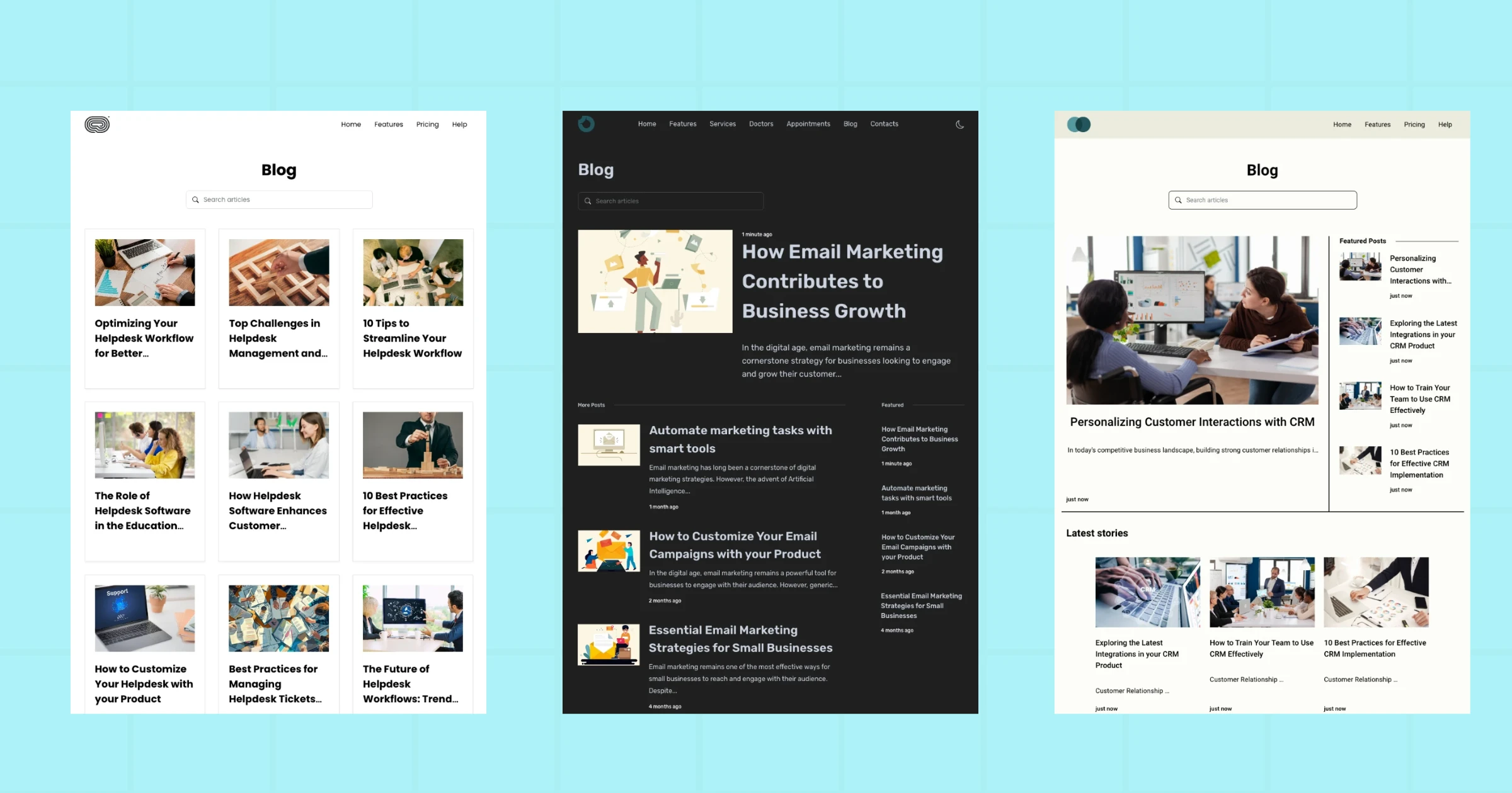
From the screenshots above, you can see how the themes come equipped with features like featured posts sections, article search, related content, and category navigation — all elements that keep readers engaged and reduce bounce rate. Each theme is:
- Consistent cross-browser rendering — all layouts are tested and validated across Chrome, Firefox, and every major browser, so what you design is exactly what your readers see.
- Built-in dark mode — readers who prefer low-light reading get a seamless experience without any extra configuration on your end.
- Performance-optimised loading — pages load fast no matter where your audience is based, which matters because Google uses page speed as a direct ranking signal.
- Fully responsive on mobile — layouts adapt automatically to any screen size, so you're never losing readers to a broken mobile experience.
- One-click social sharing and RSS — readers can share posts across platforms or follow your blog via their favourite RSS reader, helping you grow your audience passively.
Business-specific themes also mean your blog page feels cohesive with the rest of your website. Whether you're in SaaS, healthcare, e-commerce, or professional services, there's a layout designed with your content type in mind — not just your aesthetic preferences.
SEO best practices embedded into your blog layout
A well-structured layout isn't just about aesthetics — it's one of the most powerful on-page SEO levers you have. Here's how to bake SEO directly into your blog page structure:
- Place your primary keyword in the H1 and first 100 words
- Add descriptive alt text to every image for accessibility and Google Image Search visibility
- Optimise meta titles and meta descriptions — these directly affect click-through rate in search results
- Use Article schema markup to help search engines understand your content type
- Keep URLs short and keyword-rich
- Compress images and use lazy loading — every extra second of load time costs you rankings and readers
- Add a canonical tag, especially if your CMS creates tag or category pages that could duplicate post content
If you want to go further on the SEO side, SubPage's guide to optimising your blog with AI SEO tools covers how to use AI to audit and improve your existing content structure.
On SubPage, all of these technical SEO elements are built directly into the platform. You can customise meta titles, descriptions, and Open Graph images for each post from inside the editor — no developer or plugin required.
Conclusion
A great blog isn't just well-written — it's well-built. The layout you choose directly affects how long readers stay, how much they trust your brand, and whether they take the actions that matter to your business. From a compelling header and scannable subheadings to strategic internal links, mobile-first design, and business-ready themes, every element of your layout is a lever you can pull to improve both reader experience and search rankings.
With SubPage, you get professionally designed, SEO-ready blog layouts that let you focus entirely on creating great content while the structure takes care of itself. No code. No guesswork. Just a blog that works.
Ready to build a blog layout that actually converts? → Start building your blog for free at SubPage